Graphic Design Do's and Don Ts
8 Do's and Don'ts while applying illustrations in your design
![]()
Nowadays, you can get a set of ready-made illustrations and use them in your design. Despite that, choosing a correct image and using it in the right way is not a piece of cake.
So what are the do's and don'ts when applying illustrations in your design? Here are some examples from a delivery app — the OmaPosti.
Let's dive in.
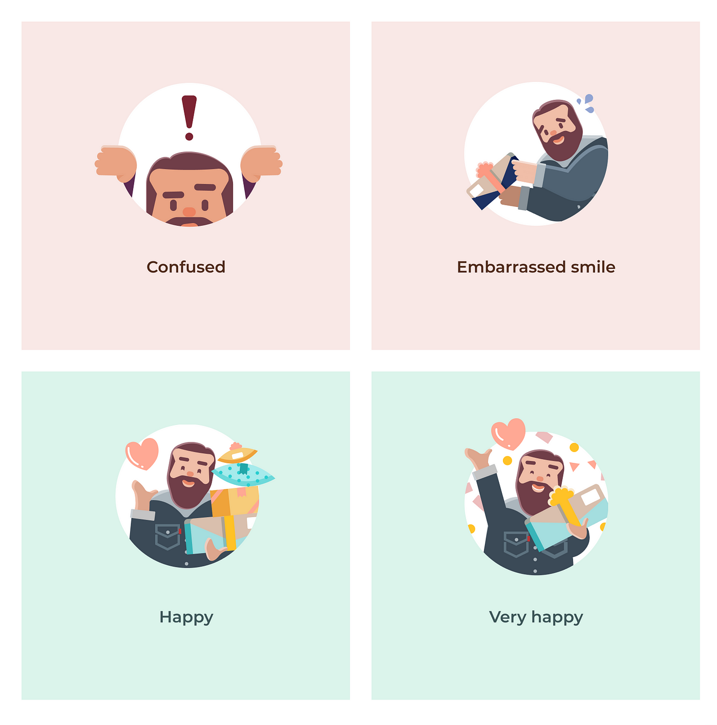
1. Do customize your graphic to the context
Customizing the graphic makes the exper i ence more personal and likeable. For example, in the OmaPosti app, if a user picks up an item from a locker, we display a parcel in a cabinet with confetti; if a user gets a delivery behind the door, we illustrate that scenario accordingly. In other words, we customized the graphic a user sees according to how they receive a parcel.
2. Do use explanation text if you wish the graphics to communicate a specific meaning
One picture can communicate many meanings. Creating texts along with the graphic can avoid double readings.
When designing for the OmaPosti app, we kept in mind that our users wanted to know how big is an item. Therefore, we showed a human holding their item to indicate the parcel size. After releasing the design, people complained that the graphic we provided was a useless decoration picture. Then, we understood the illustration itself was not self-explanatory. Hence, we added a speech bubble — your item could be as big as this one. Since then, I have heard a lot of positive feedback, e.g., "Now I know if I can pick up the item after my grocery shopping".
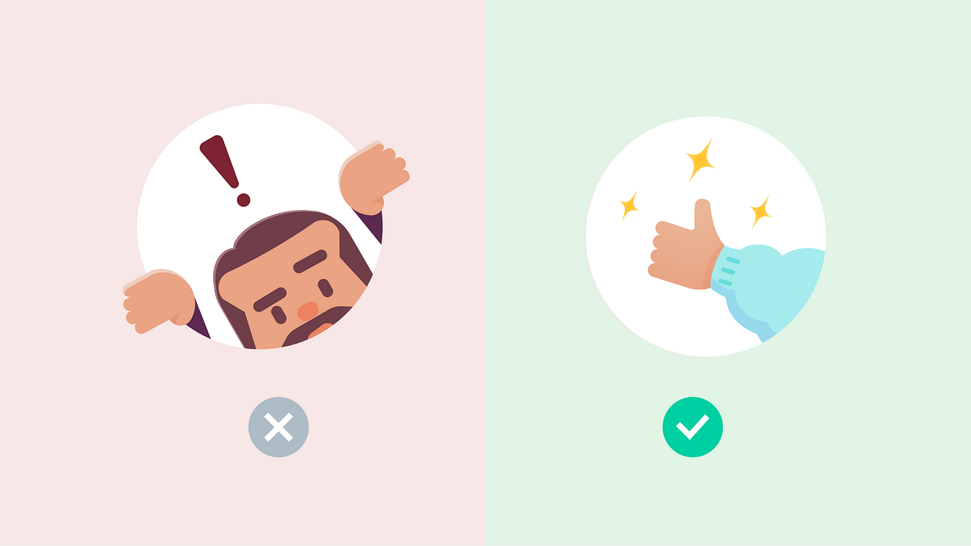
3. Do make sure your character' facial expression matches the message you are communicating

If there is a cartoon character in your graphic, make sure its face and the illustration communicate the same message. Otherwise, it might lead to confusion for the users. You can study your own expression and alter the character's face accordingly.
4. Do ensure enough contrast between the content and the background
Good contrast makes all the shapes on the graphic easy to recognize. It is also more accessible for users with poor vision.
5. Don't invent new colours when you can apply the existing ones from icons, text, buttons
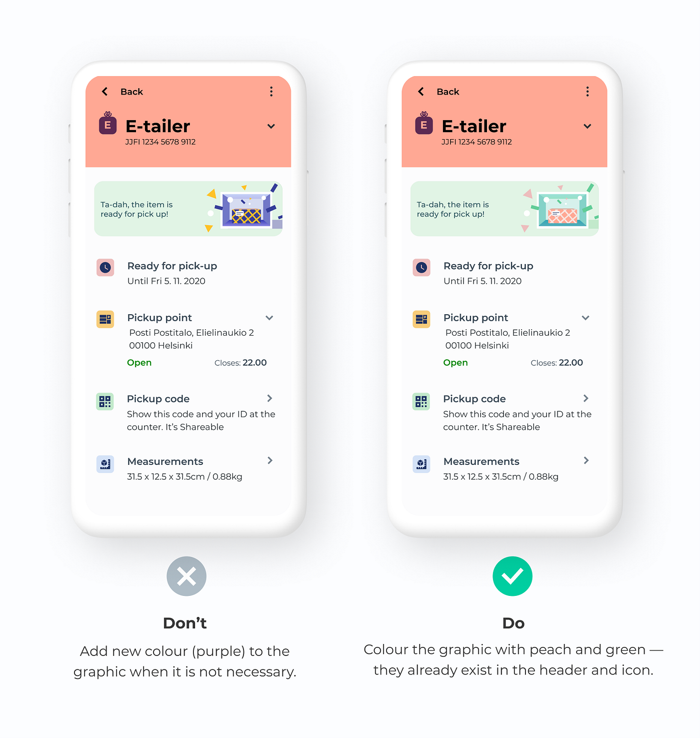
When inserting a graphic into an interface, I like to recolour it with existing colours in the current view. Reducing colour numbers helps unify the look and feel of the brand.
6. Don't show a picture that indicates gender stereotype
There was a surprising finding in one of our interviews. Users didn't like the graphic that implied gender stereotypes. Many users reacted negatively towards the image of a lady in a tight short dress and high heels.
7. Don't misuse graphics. Better no image than a confusing illustration
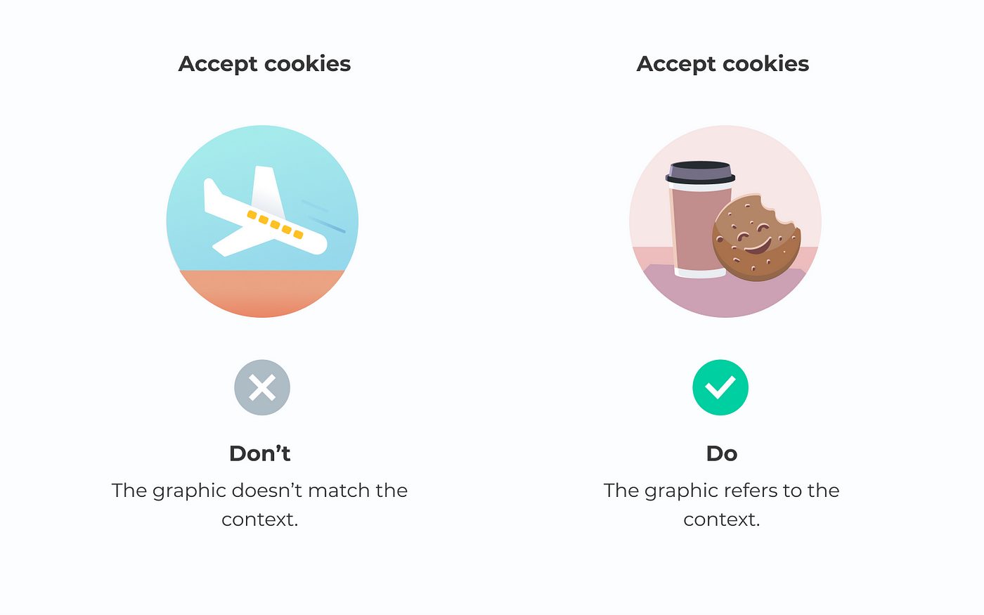
Illustrations play a vital role to communicate crucial information. However, sometimes designers may not find the best option and take something irrelevant. As a result, the users might feel confused about the unmatched text and graphics.
8. Don't overuse graphics
Overusing illustrations will weaken the celebration atmosphere at the end of the journey. Also, it will add clutter to stop users from completing tasks. Only use graphics in the necessary place.
Graphic Design Do's and Don Ts
Source: https://blog.prototypr.io/8-dos-and-don-ts-while-applying-illustrations-in-your-design-546476031c7e
0 Response to "Graphic Design Do's and Don Ts"
Post a Comment